Form
During joint workshops we have formulated three subjects that describe their approach: Community, Method, Projects.
Community — ideas that are born out of collaboration; Method — conceptual framework of projects; Projects — where ideas get their material form.
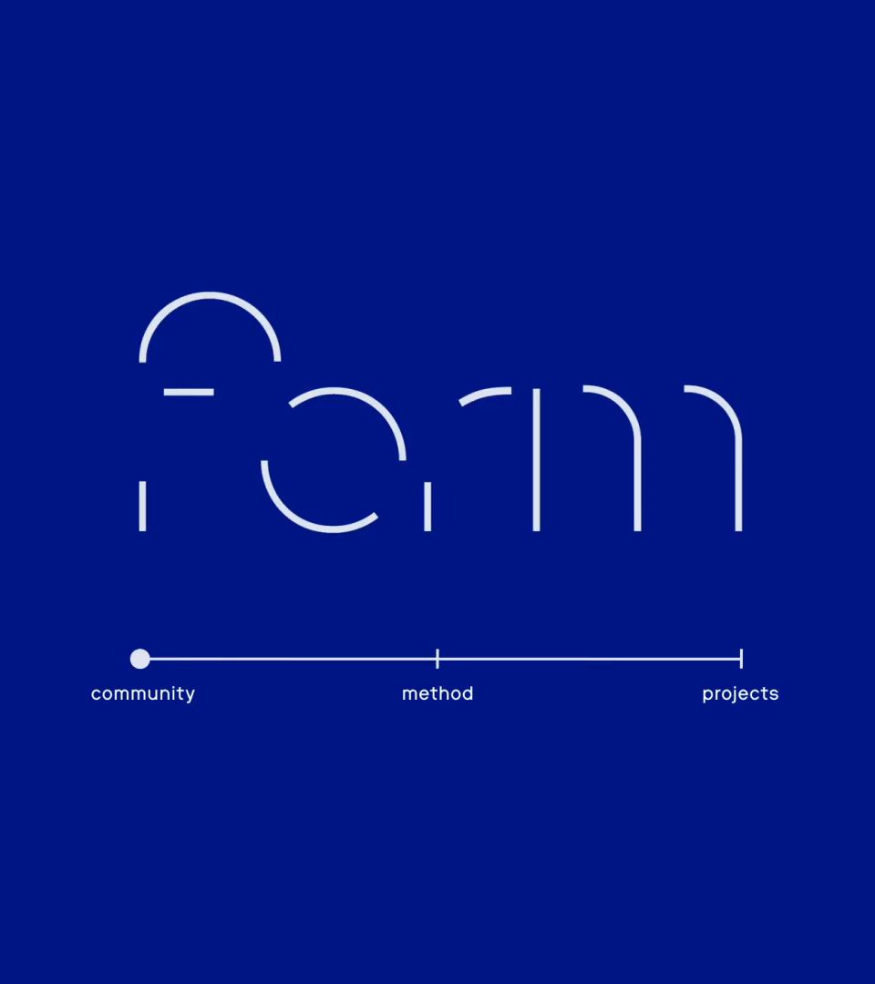
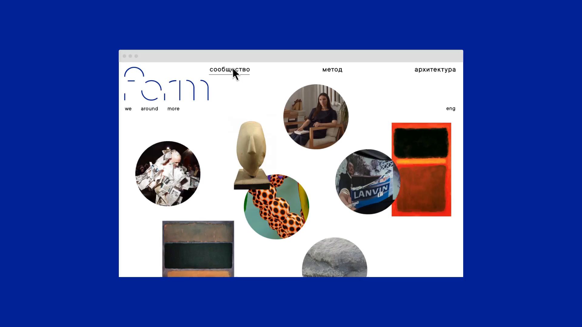
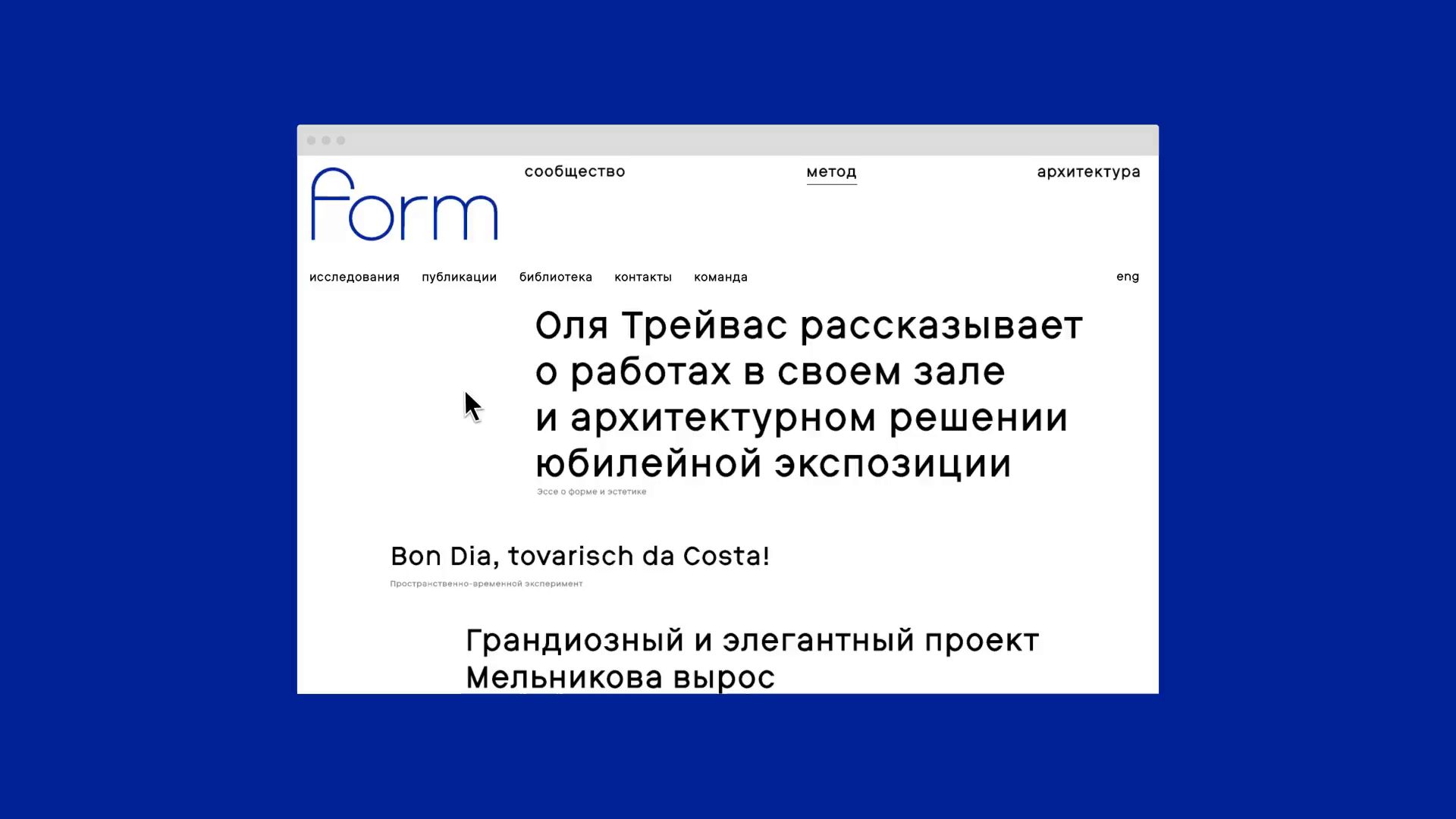
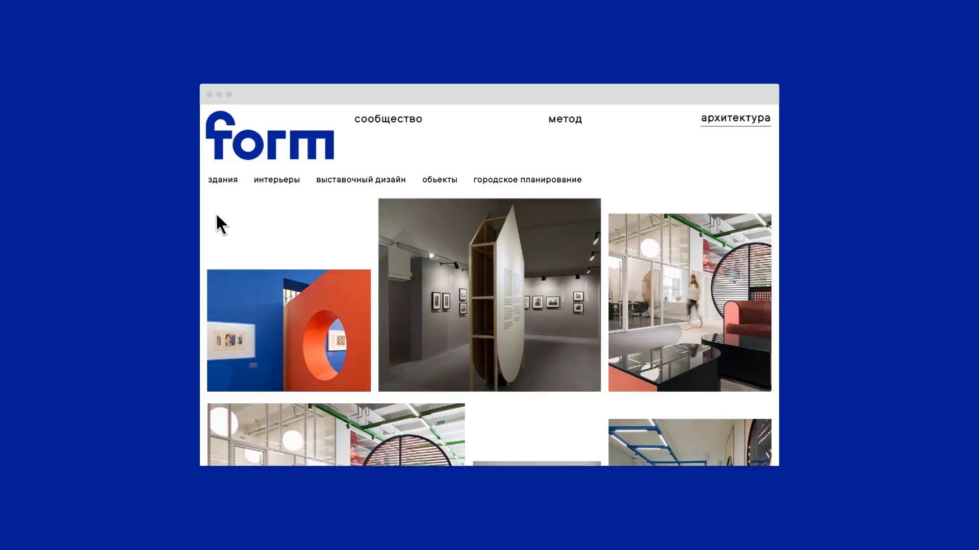
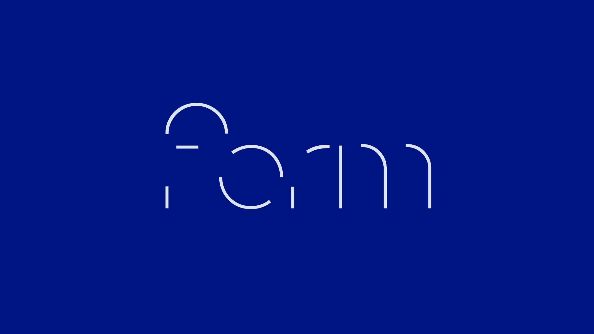
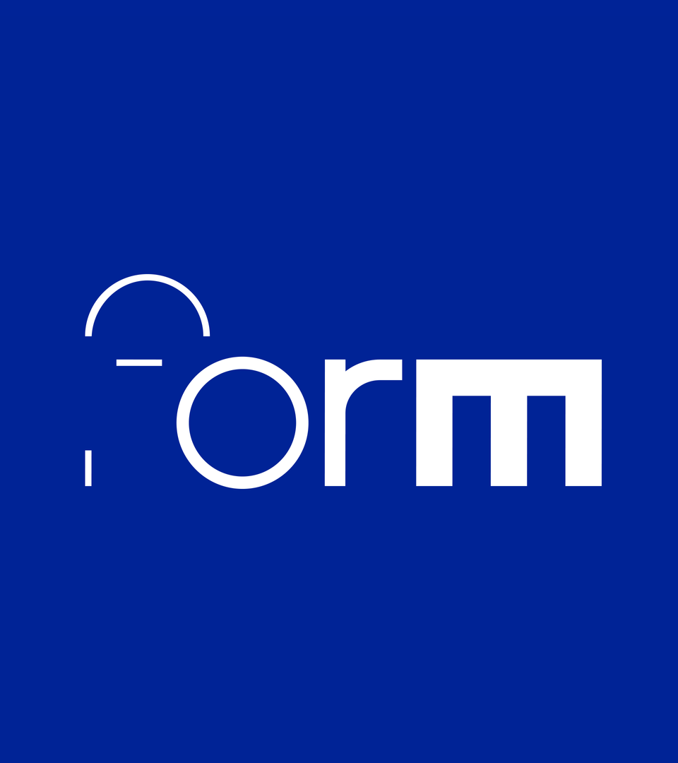
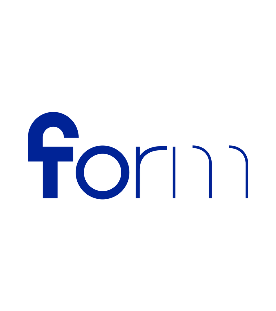
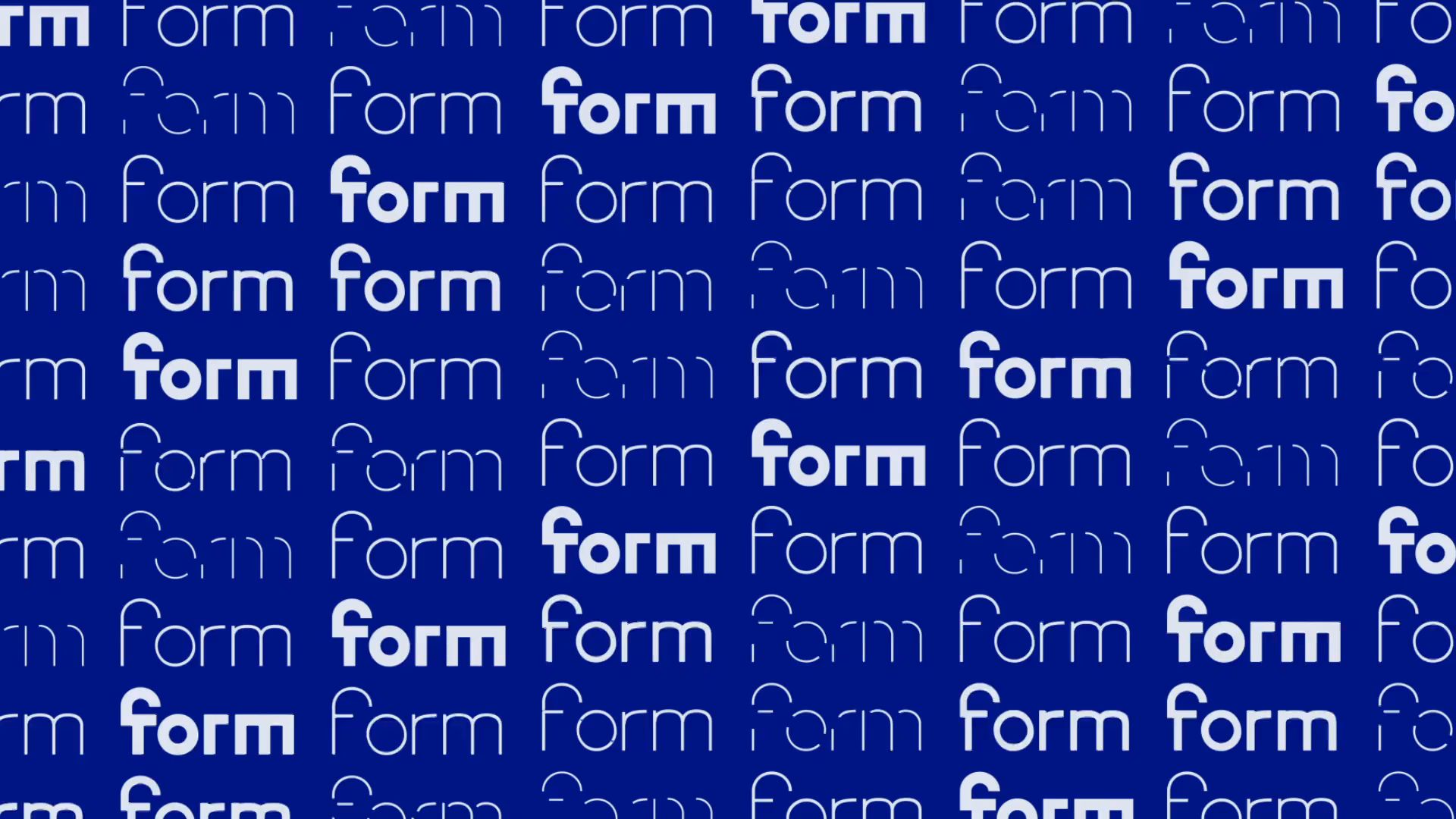
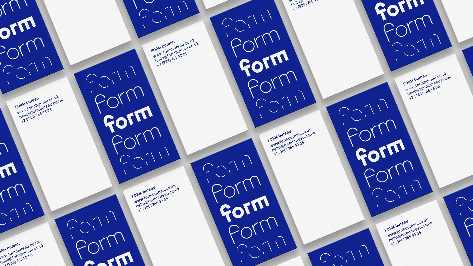
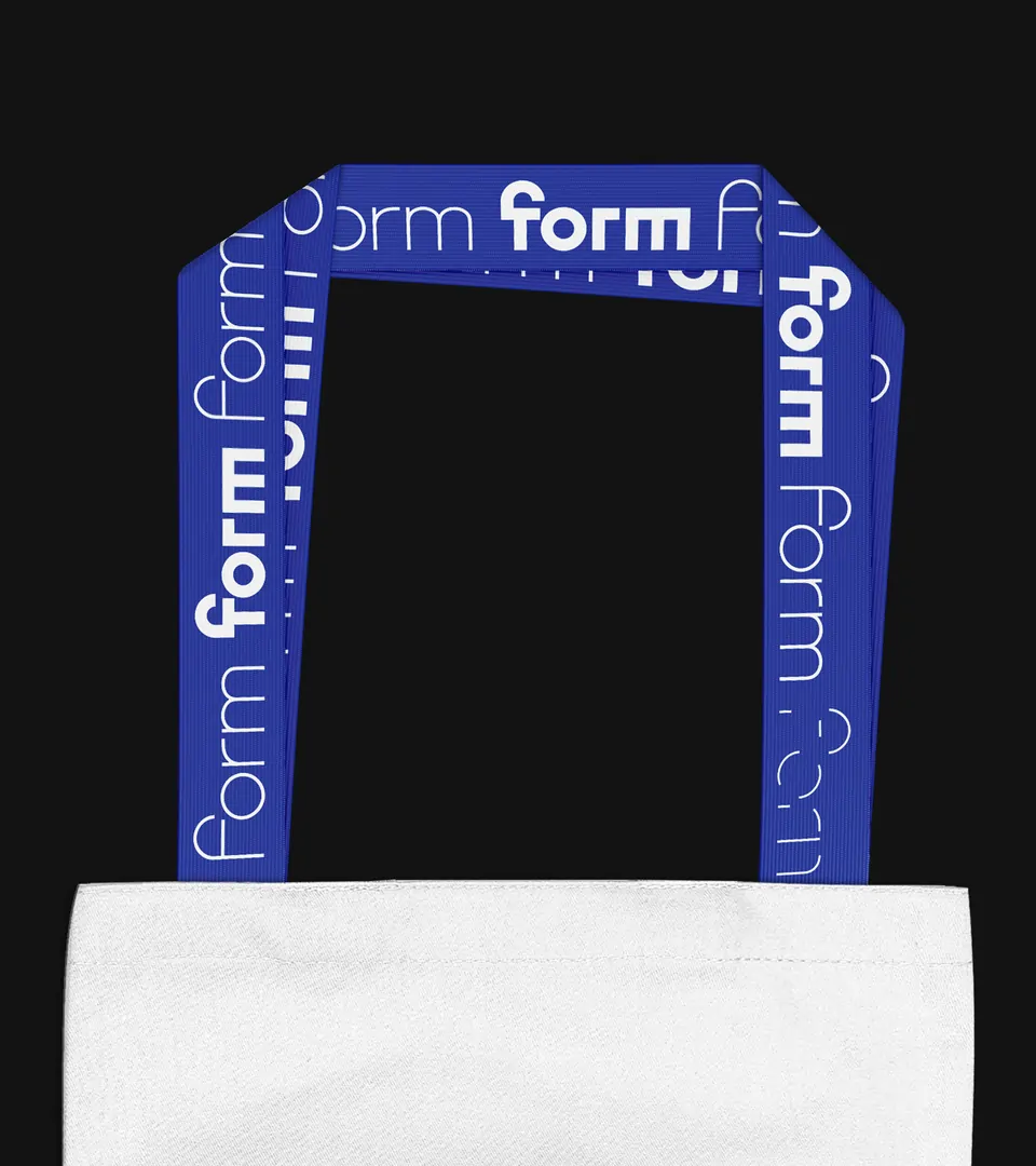
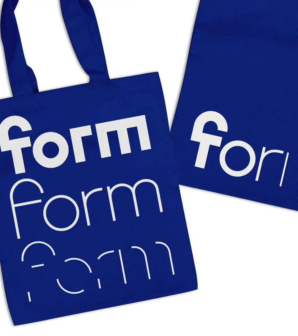
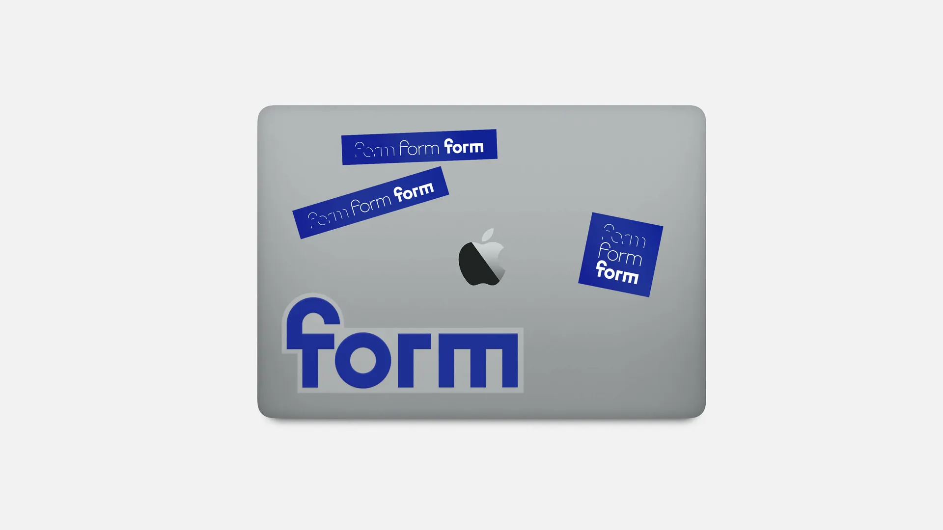
Using this concept, we proposed a dynamic logo with three states for each theme. It also comes in a variable font version for smooth web animations.
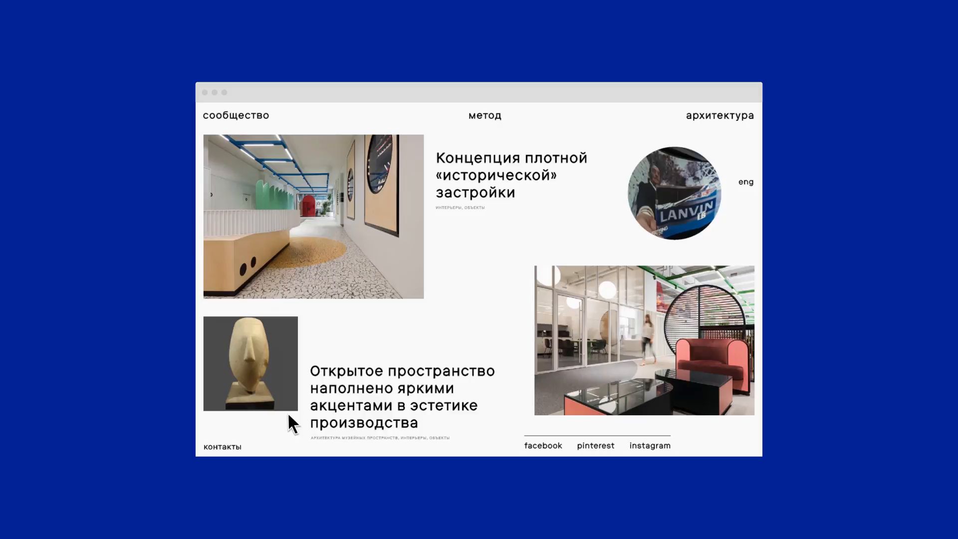
FORM’s website also has three sections. "Community" is a mood board curated by the team. Here they post links to articles, projects, and events. "Method" is a library of the bureau’s own articles and studies. "Projects" is a portfolio page, where big images become the main focus.
