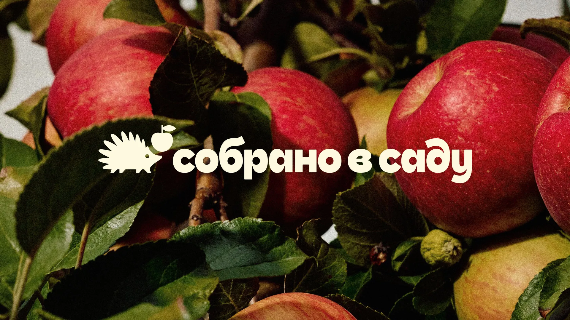
Sóbrano v Sadú

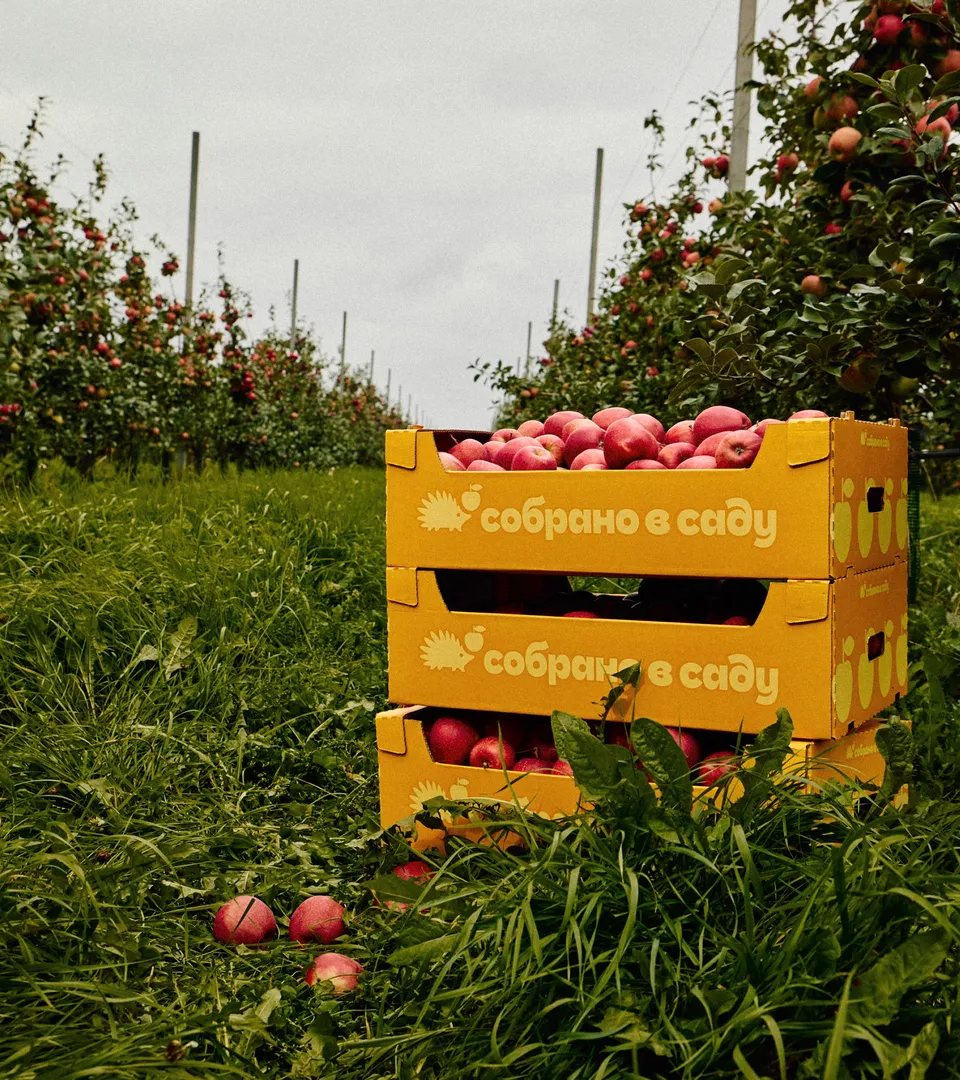
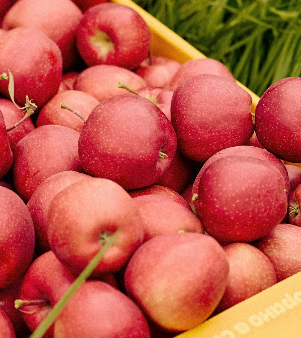
Sóbrano v Sadú (“Gathered in the Garden”) is a new apple brand challenging the idea that apples are boring. With thousands of varieties, each has its own character. The rebrand highlights this diversity while expressing core values: natural taste, curiosity, and nostalgic childhood memories.

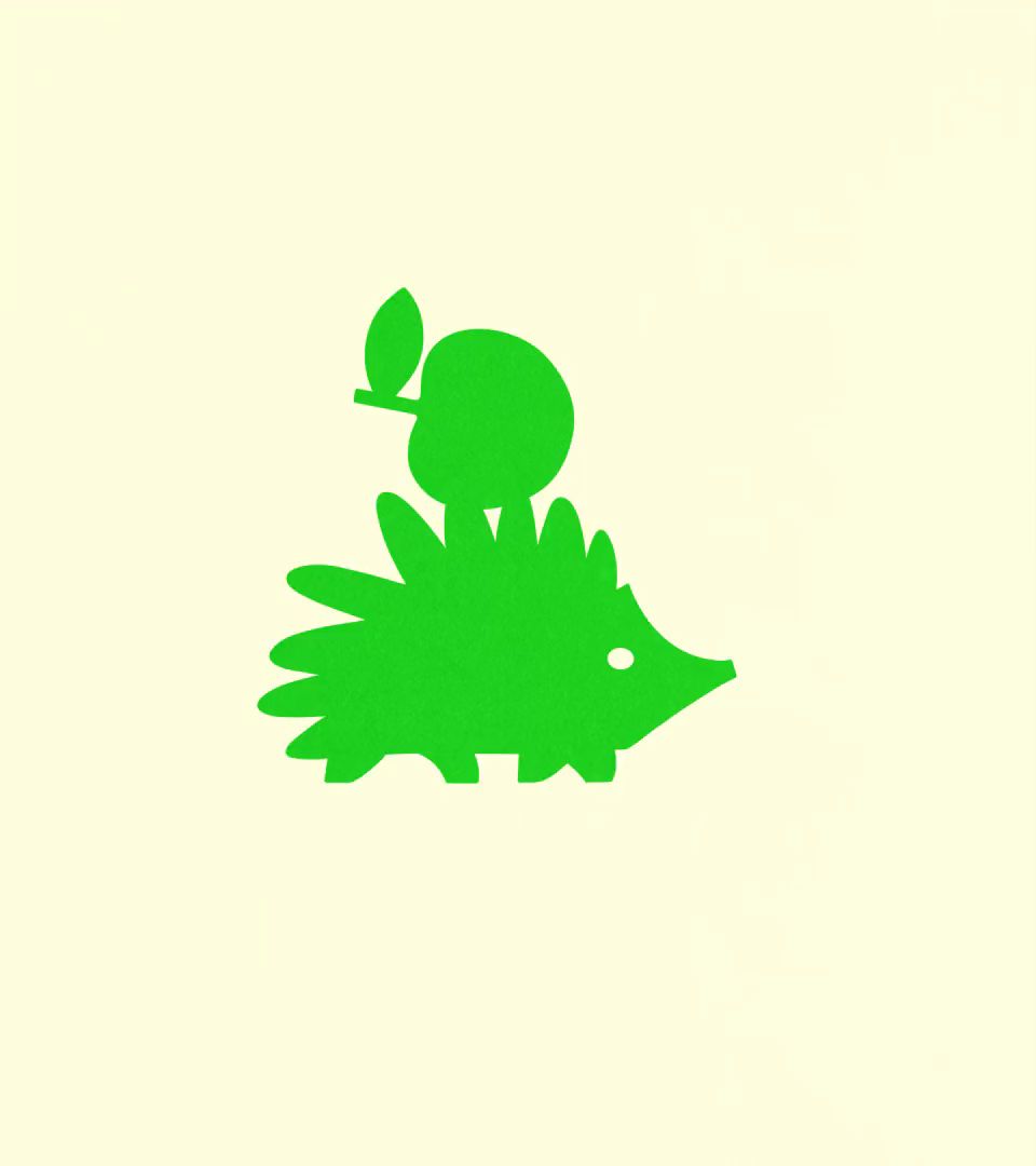
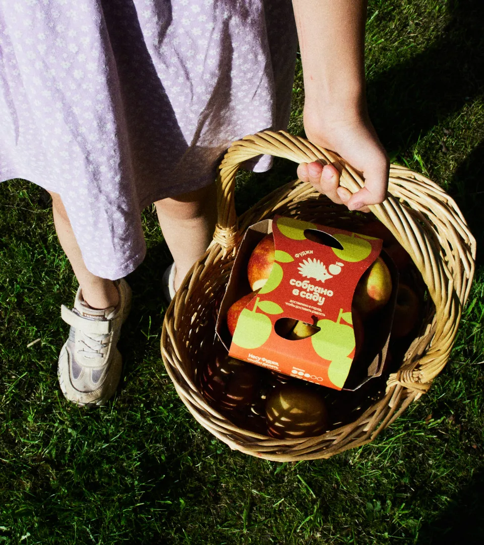
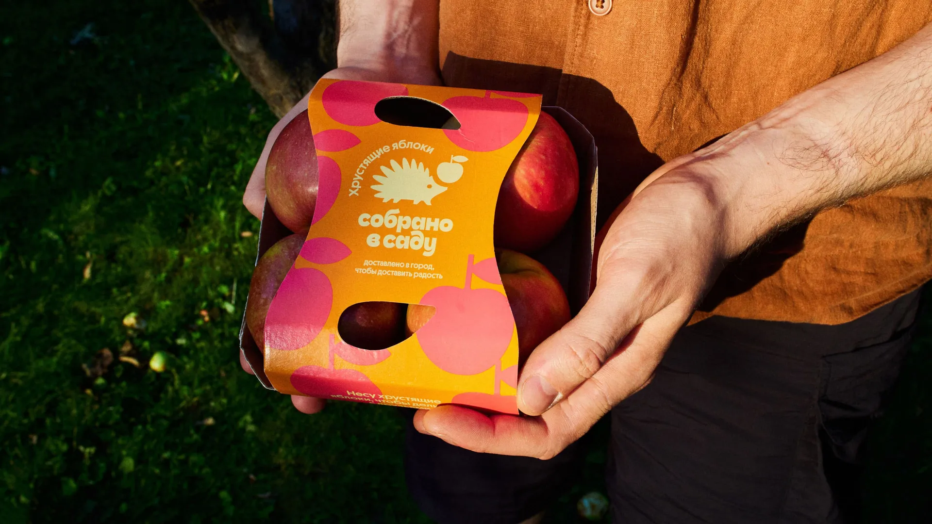
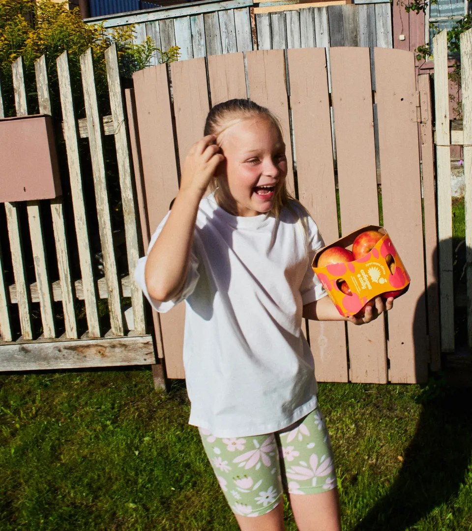
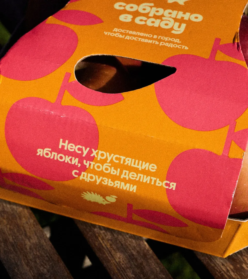
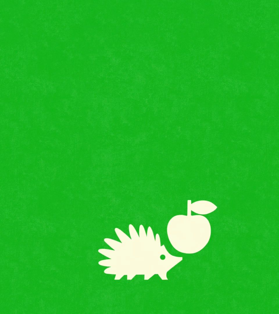
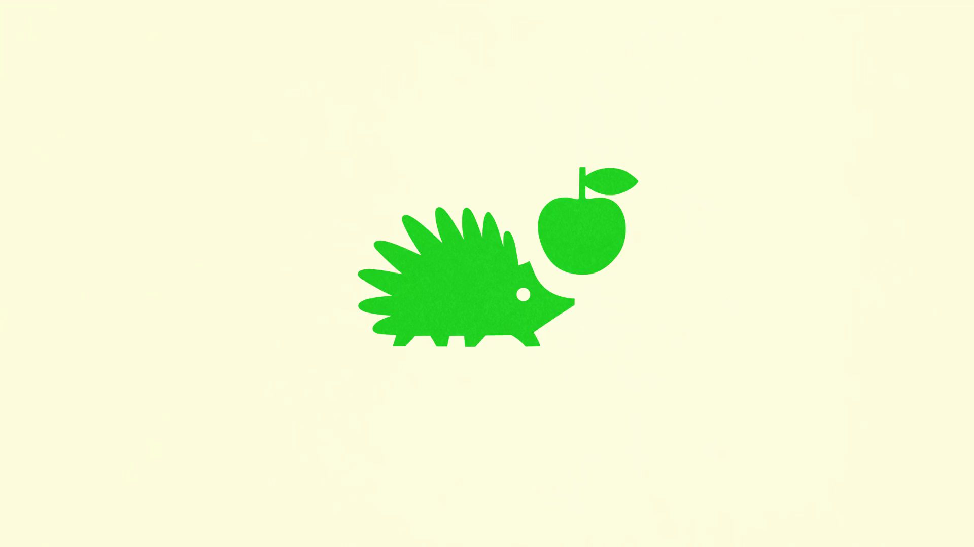
At the heart of the brand is a friendly hedgehog mascot that brings personality and playfulness to the identity. Appearing on packaging, the website, social media, animations, it makes the brand instantly recognizable — even if customers forget the name, they remember the apples with the hedgehog.
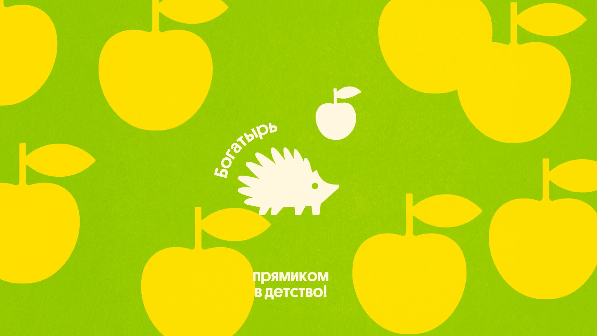
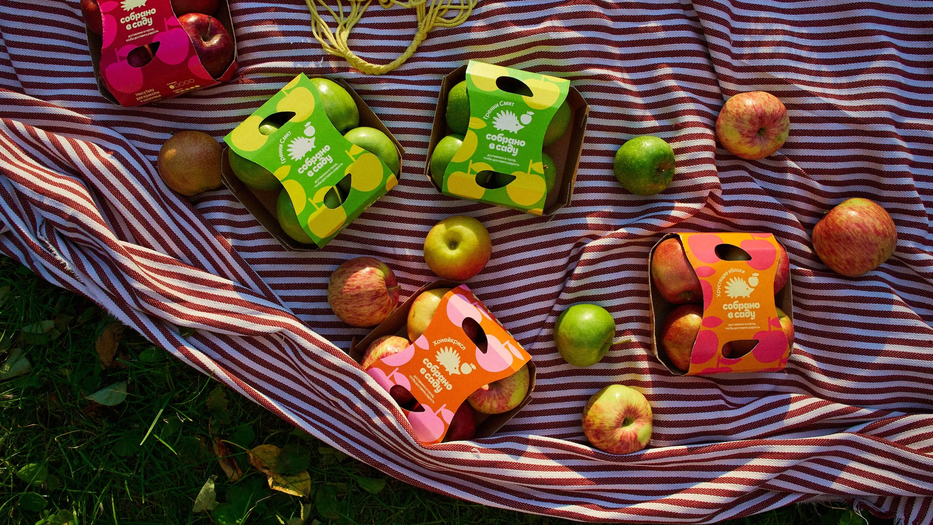
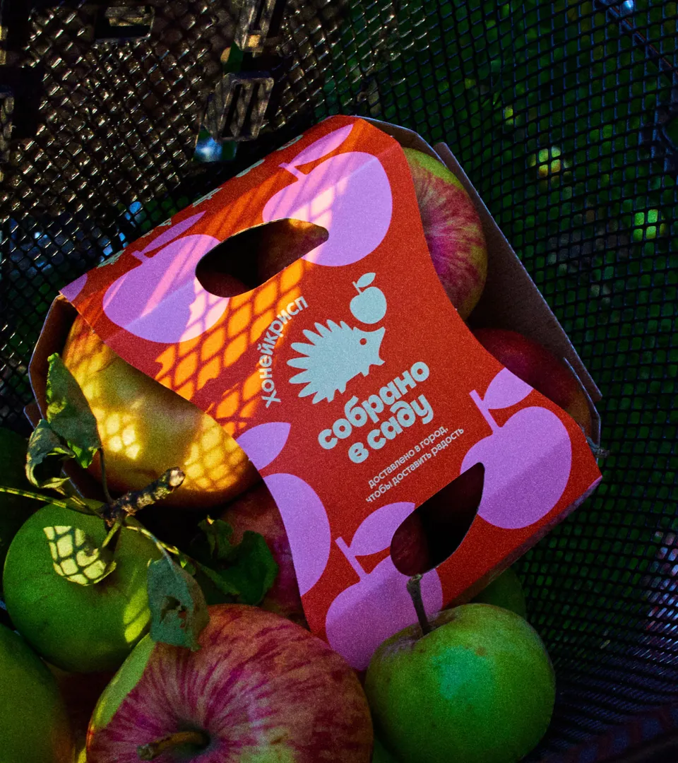
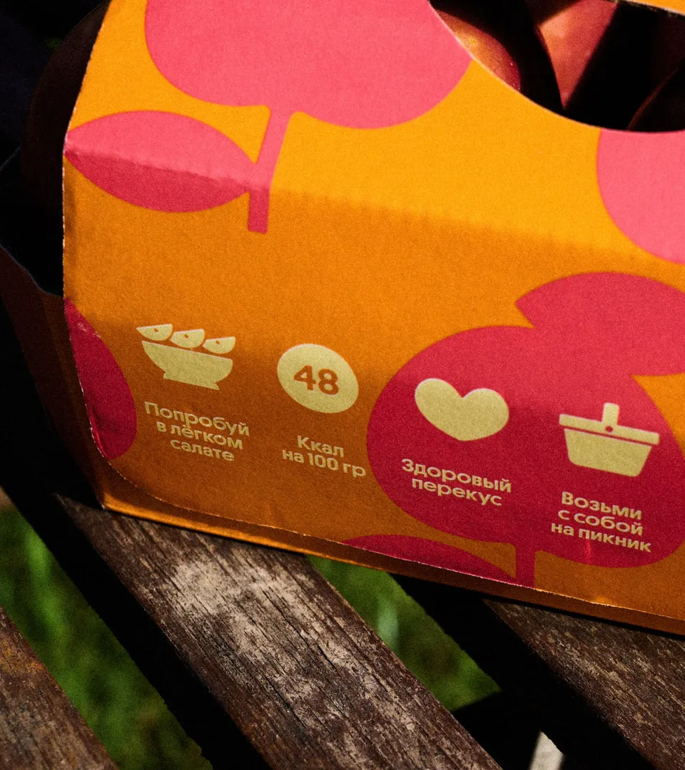
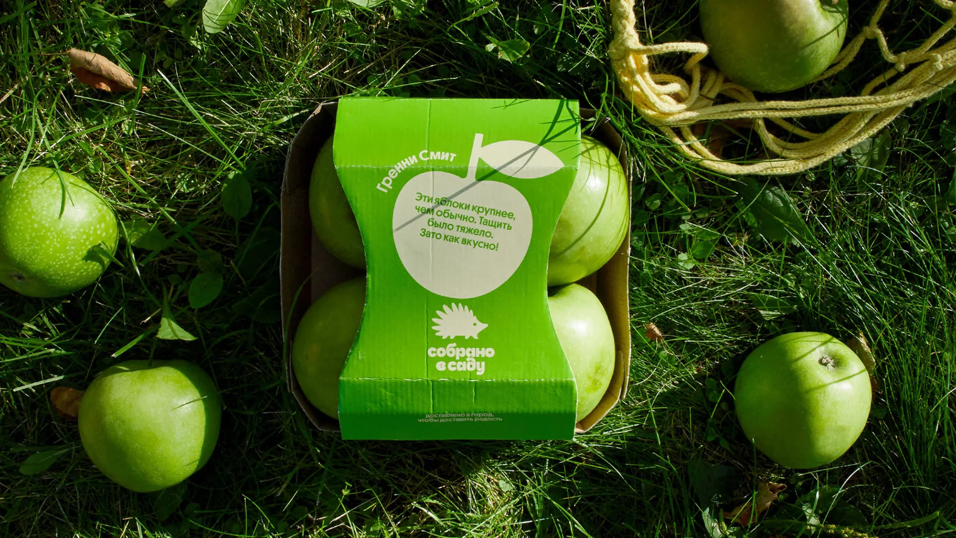
One detail we appreciate is that the side handle cutouts are shaped like apple seeds. This is a subtle nod to the letter “B” in the logo, which comes from the Cyrillic phrase “v Sadu.” The cutouts not only add a playful touch but also make the box easier to carry with one hand.


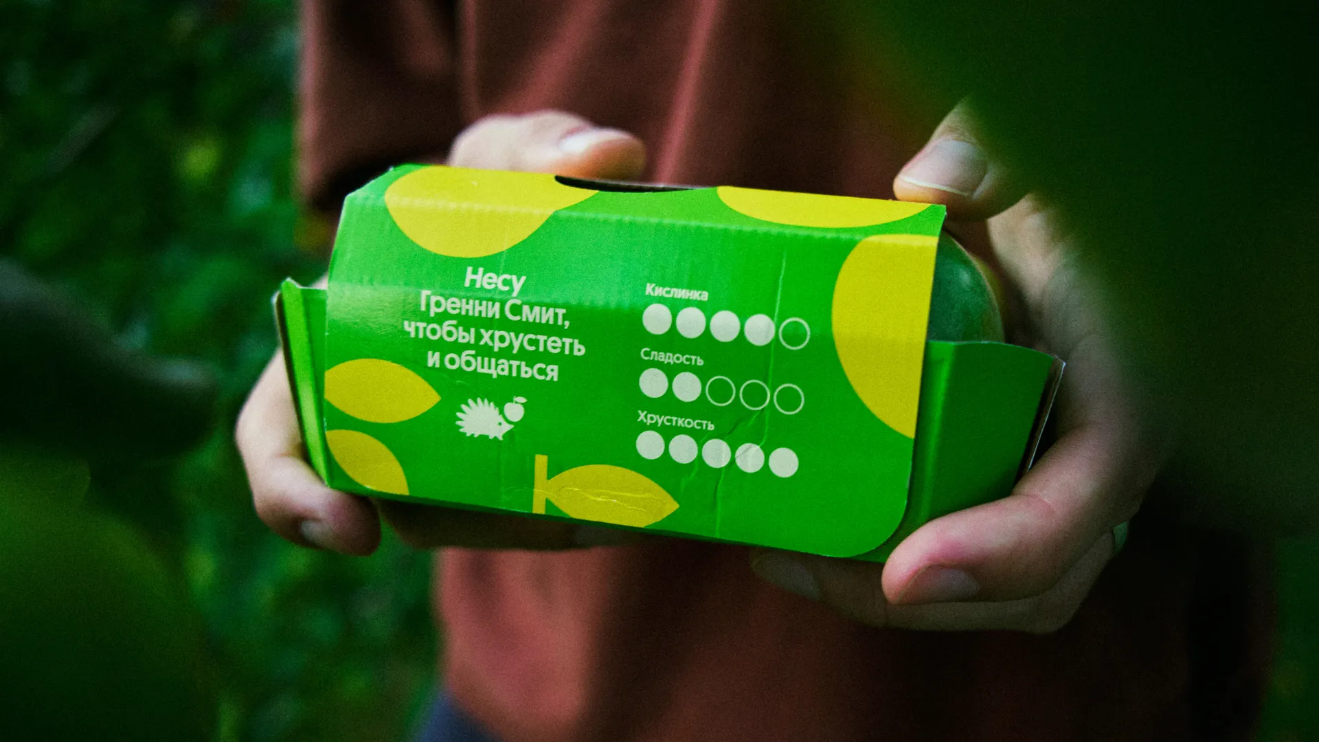
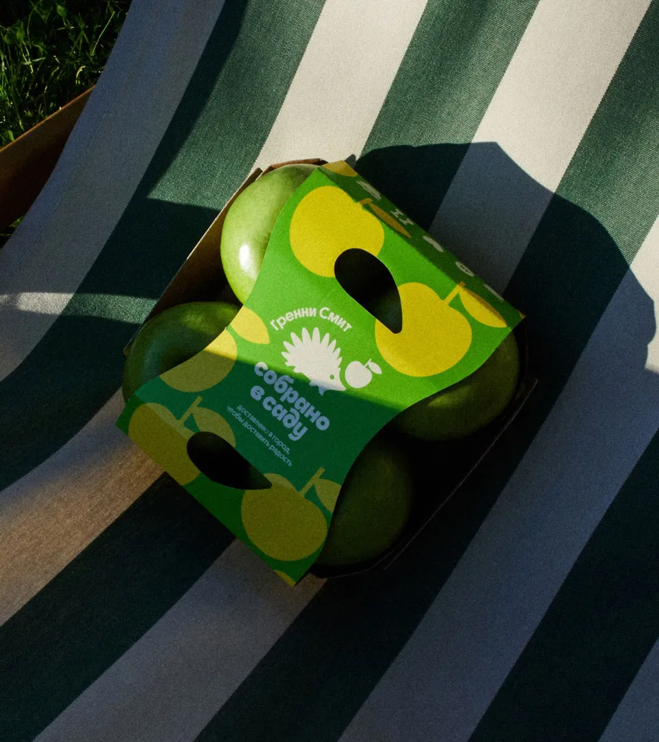
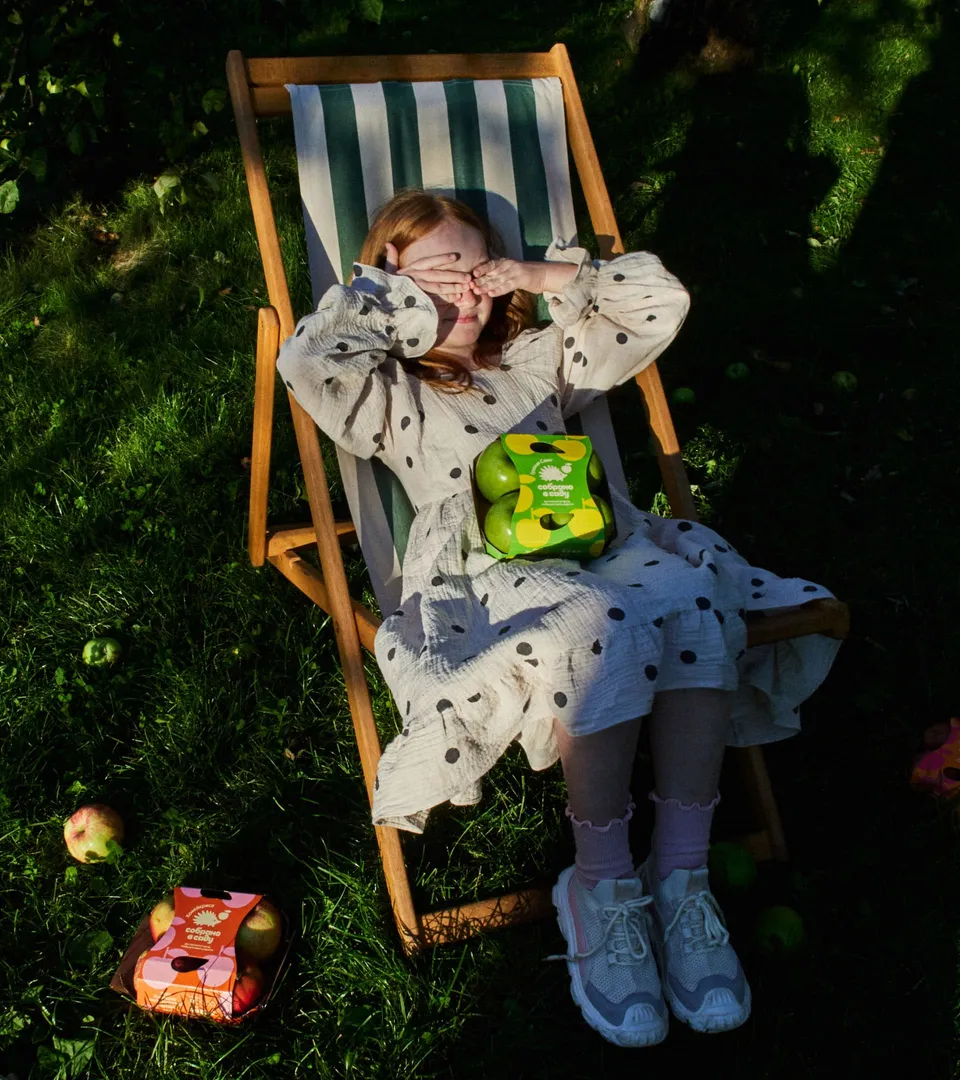

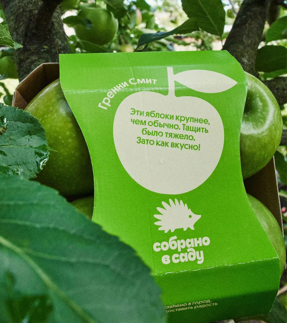
The packaging highlights each apple variety through bold visuals and an uplifting tone. Every variety has its own bright palette, keywords, and serving tips. The back features a short hedgehog-narrated story, icons, and a flavor scale to help choose at a glance.

For larger apples, we added a special twist to the packaging. We illustrated an oversized apple and placed a short message on it from the hedgehog’s perspective, joking that carrying it was heavy — but absolutely worth it for how delicious it is.
Art Director
Stefan Lashko
Art Director
Eugenia Maximova
Lead Designer
Eugenia Maximova
Design
Ksenia Ovchinnikova
Design
Nastya Lipyagovskaya
Logo Design
Ekaterina Daugel-Dauge
Brand Strategy
Maria Lutsenko
Copywriting
Ksenia Petrova
Copywriting
Eugenia Maximova
Project Management
Ivan Matskevich
Animation
Slava Nazarenko
Motion Design
Zhenya Nikitin
Photo & Film Direction
Eugenia Maximova
Cast
Taina, Sasha, Agnia & ESH team
Marketing Direction (Sobrano v Sadu)
Evgeniya Palenova
Brand Management (Sobrano v Sadu)
Marta Agrba
Quality Direction (Sobrano v Sadu)
Varvara Soshina
Client
Year
2024-2025
