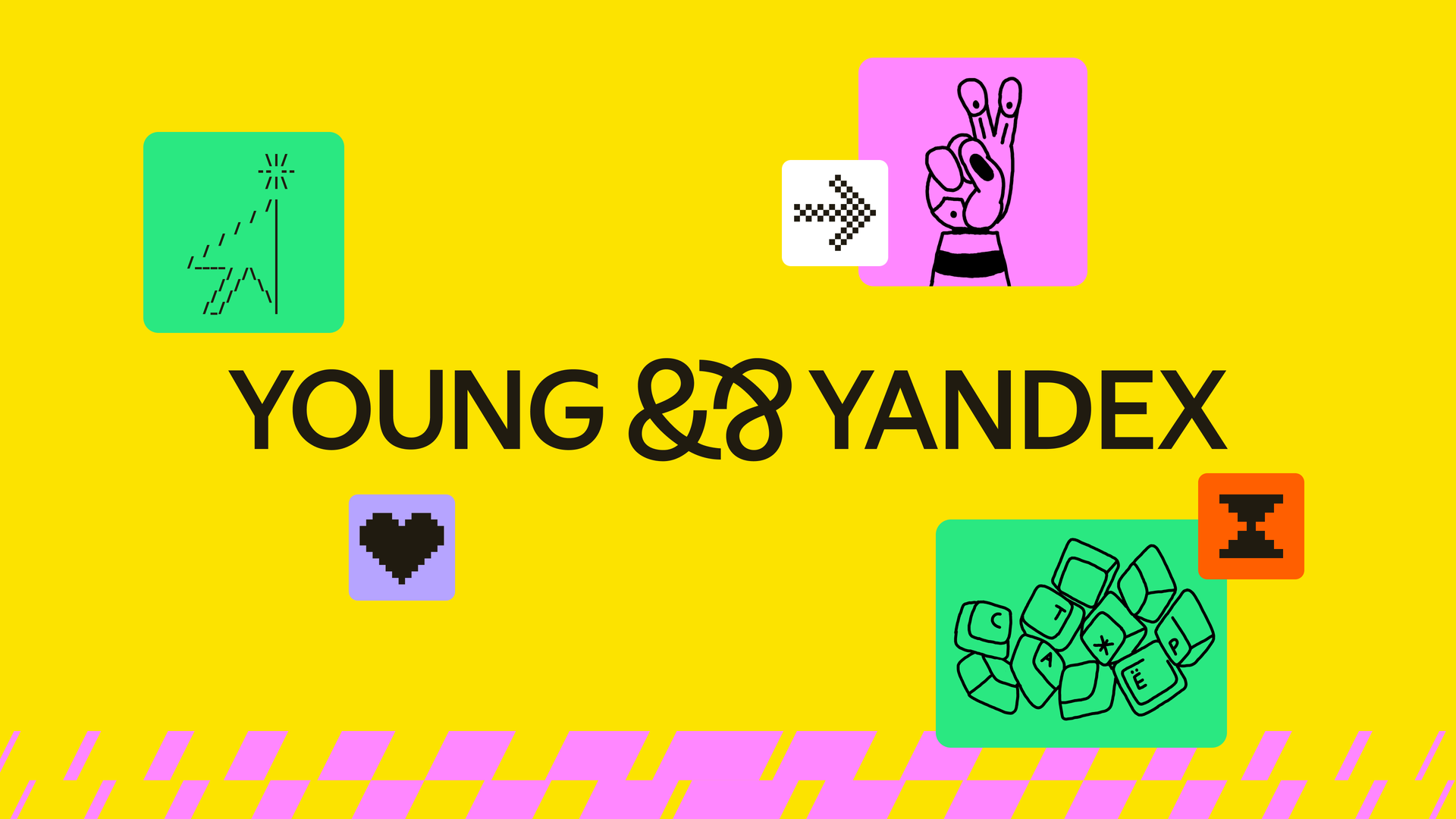
Young&&Yandex

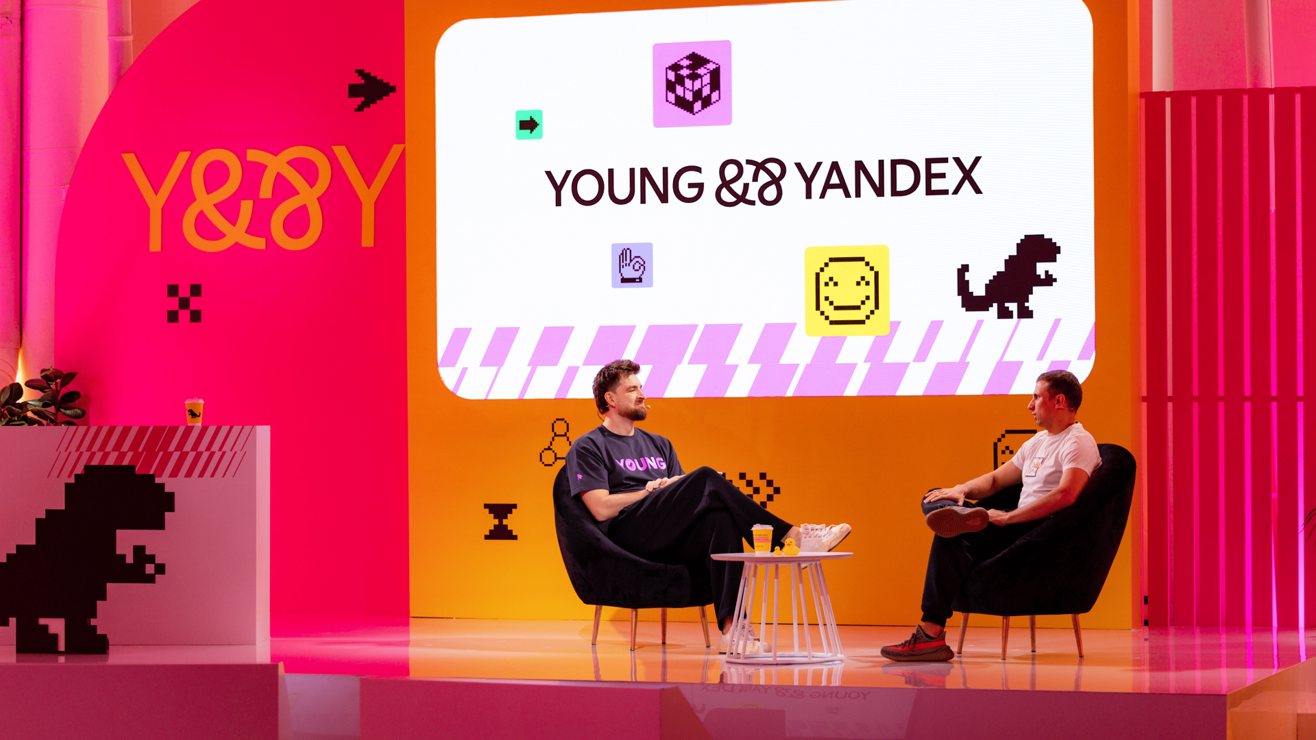
Young&&Yandex is a community for young IT professionals offering internships, events, and career opportunities. We asked what that moment feels like and found our core idea: productive imperfection — a time to explore, experiment, and discover extraordinary solutions.
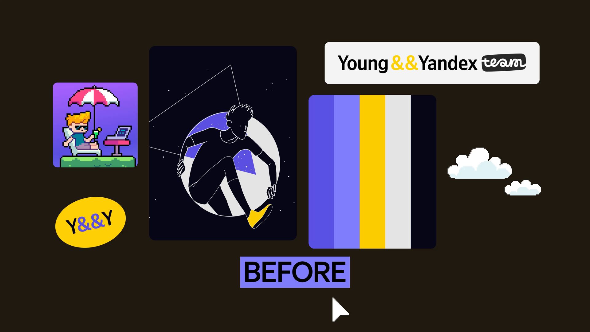
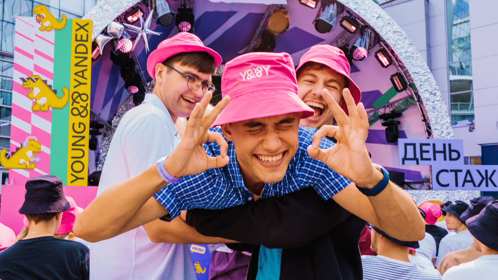
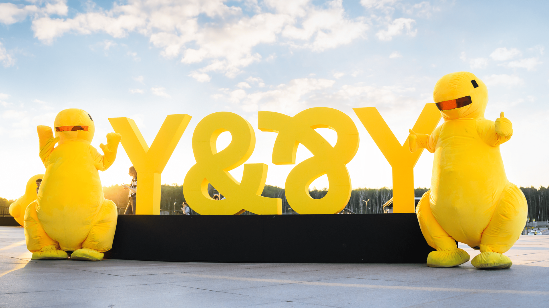
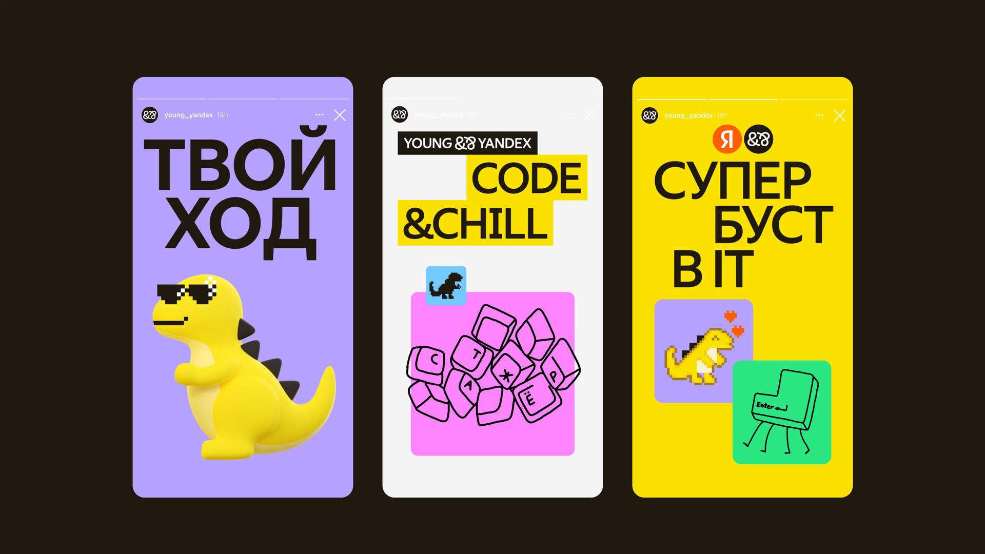
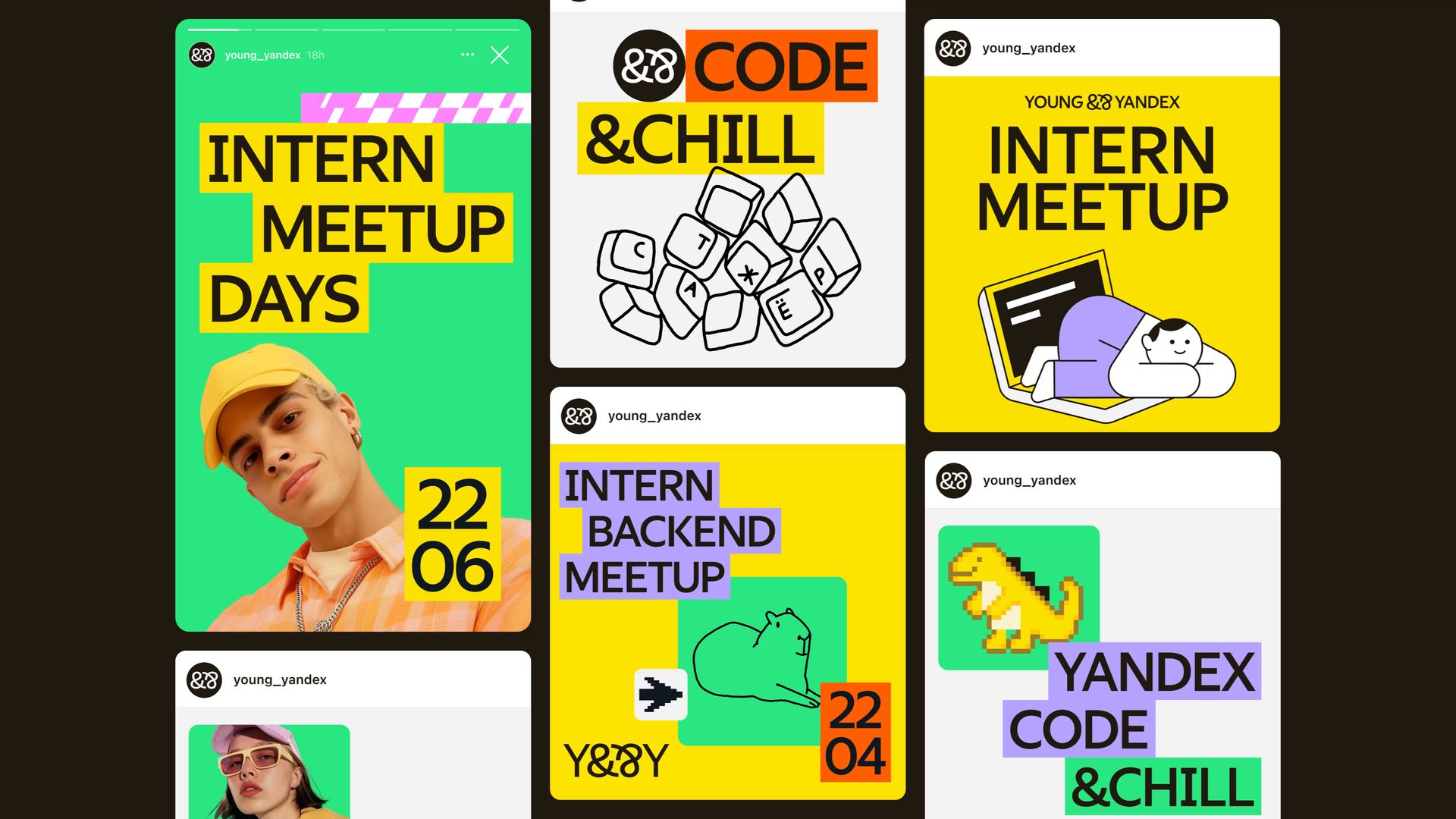
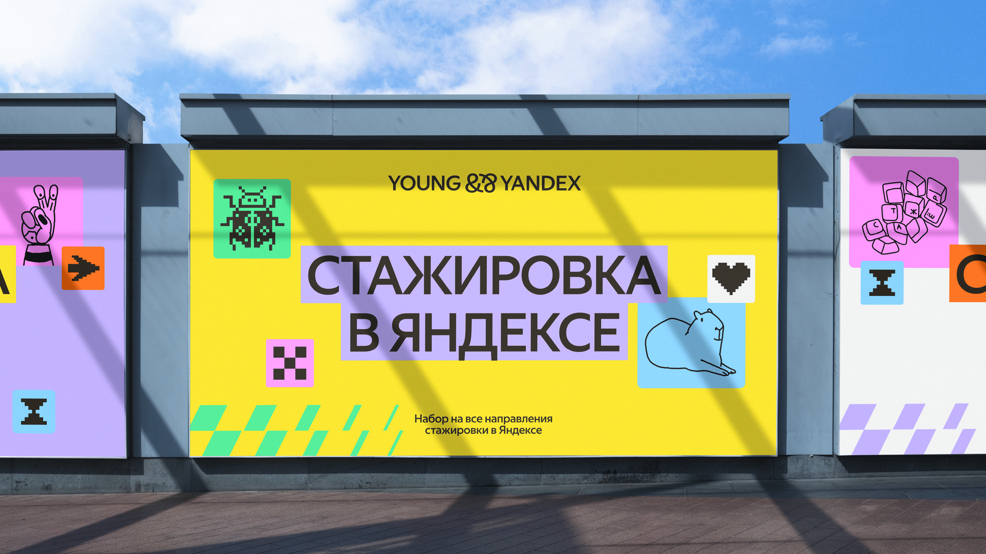
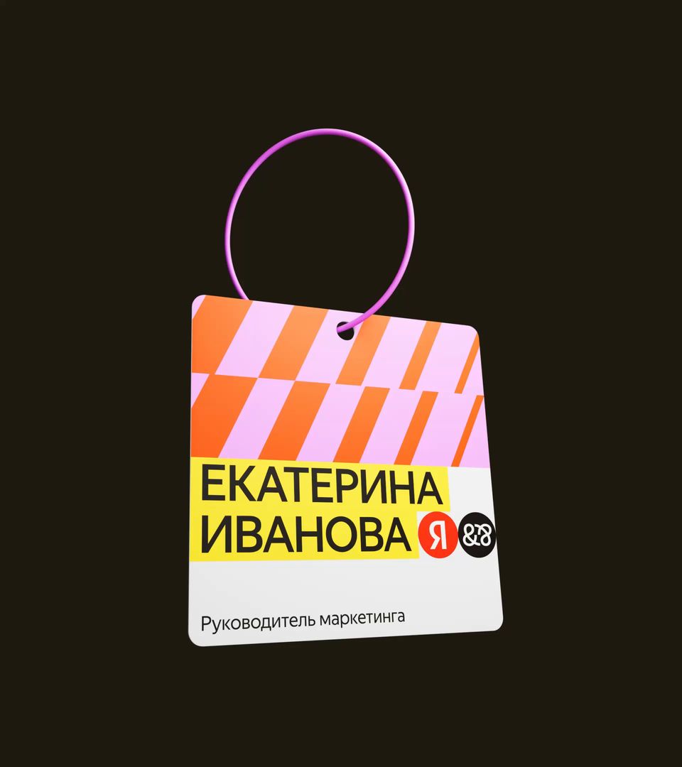
In the rebrand, we set out to bring fresh, relatable energy to the identity, while keeping it connected to the Yandex ecosystem. The design is bold and driven, yet welcoming to the interns. We kept the beloved mascots and built a flexible system suitable for everything — from socials to events.

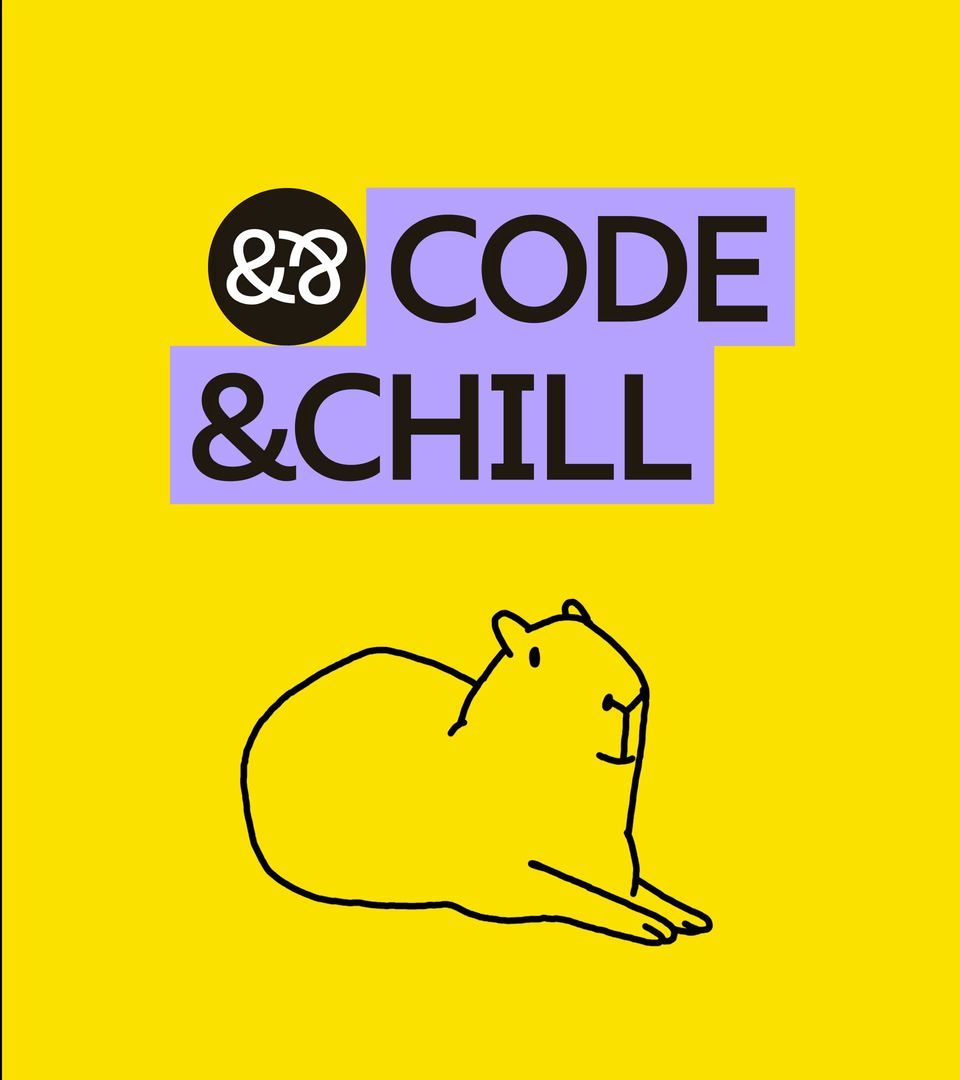
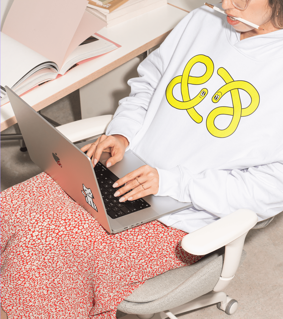
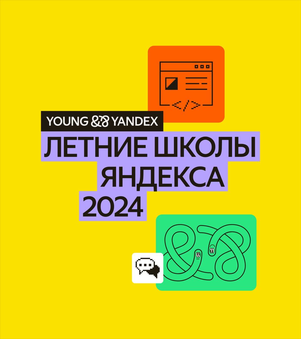
The updated logo features two ampersands facing each other, symbolizing dialogue and collaboration. We kept the familiar Yandex Geo typeface and signature yellow but brought more freedom and energy to the design system.

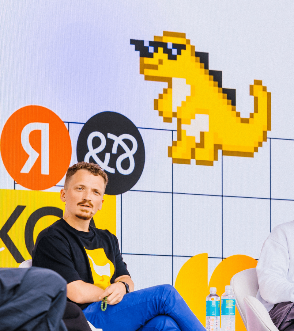
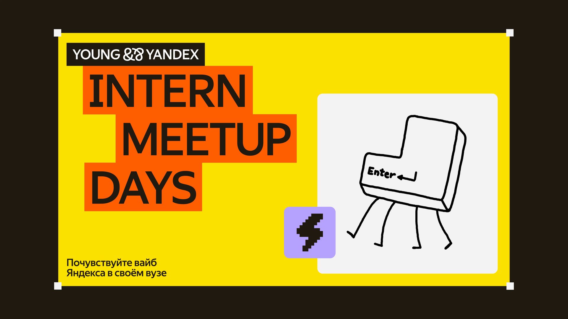

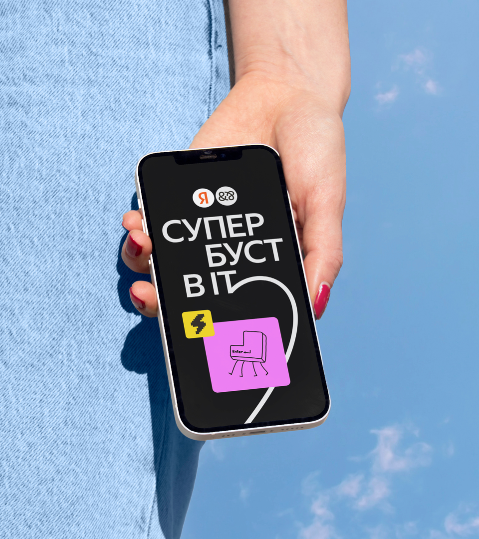
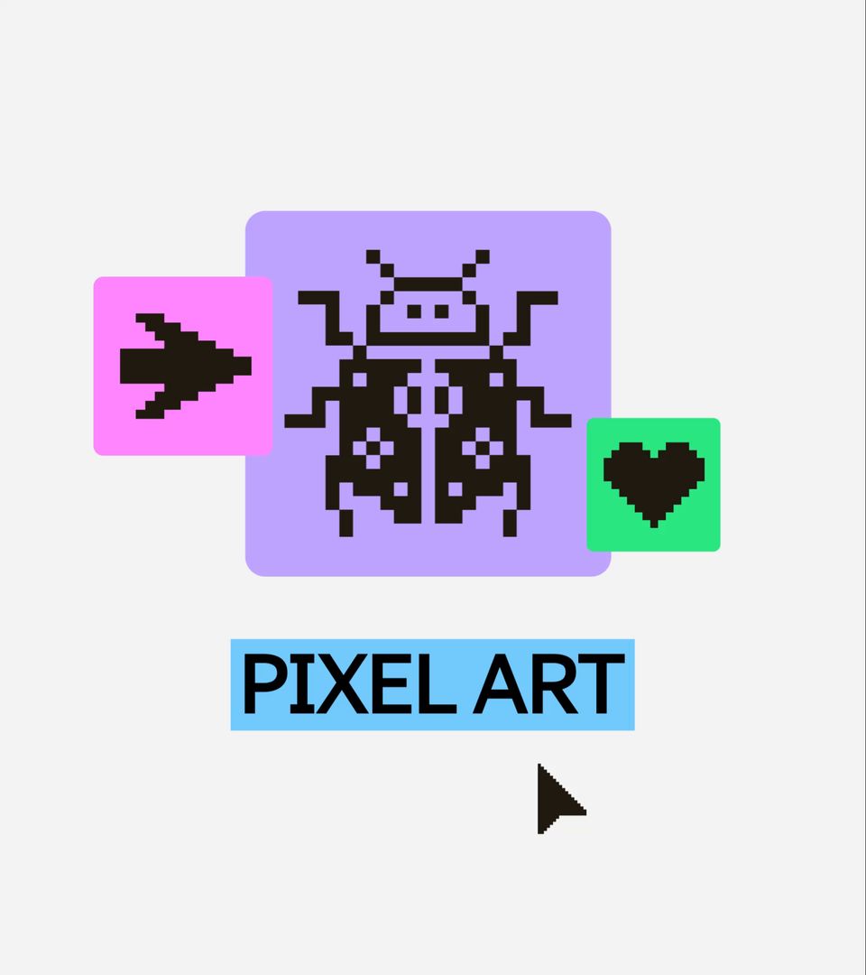
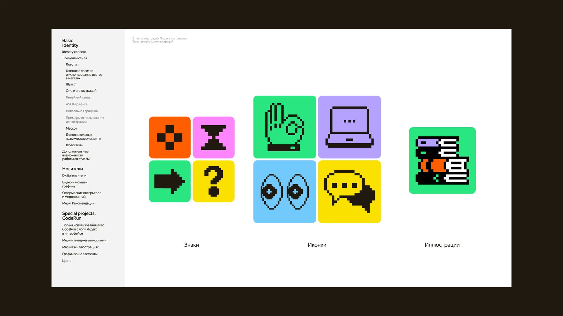
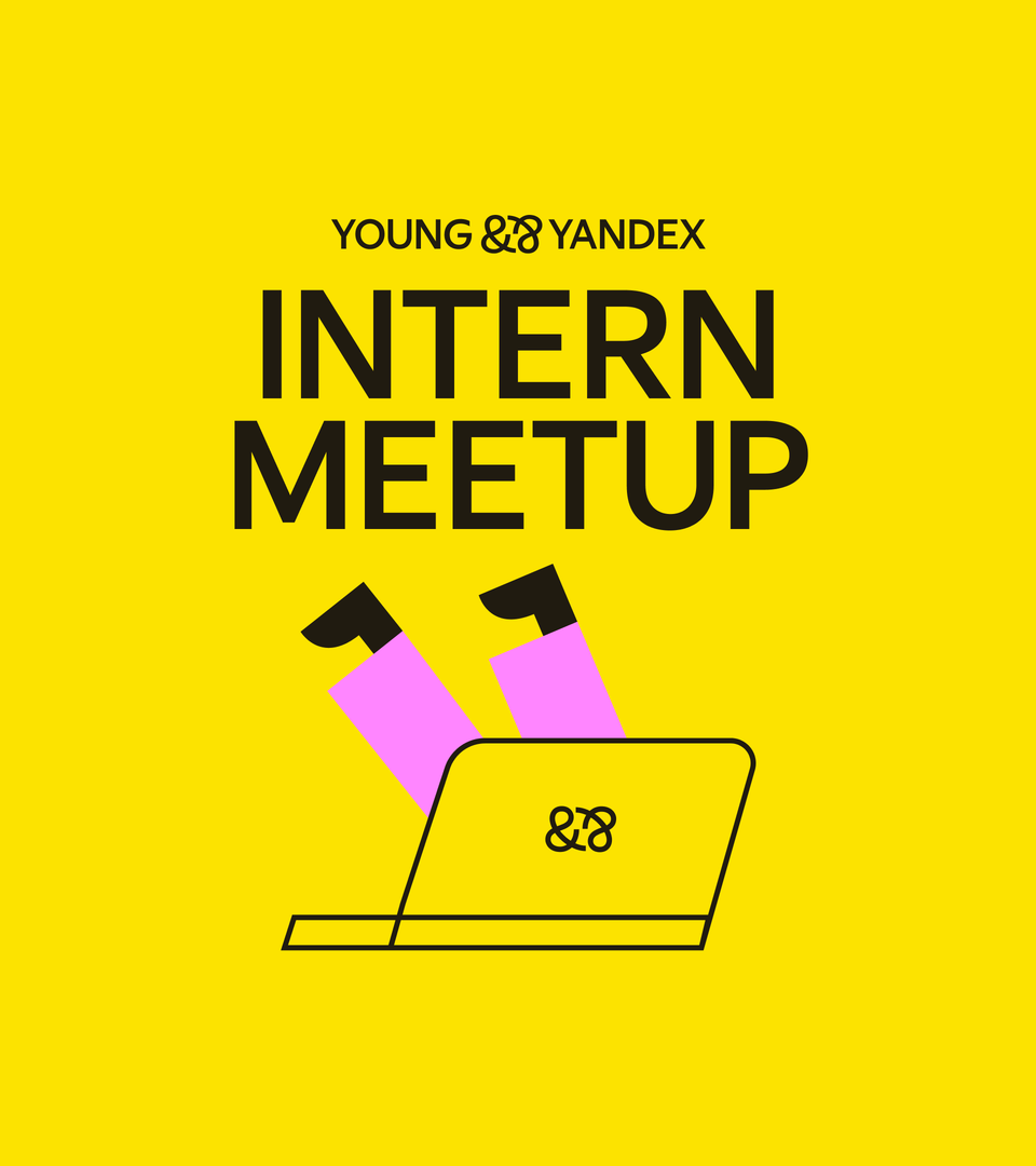
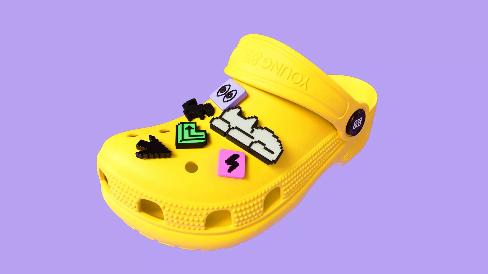
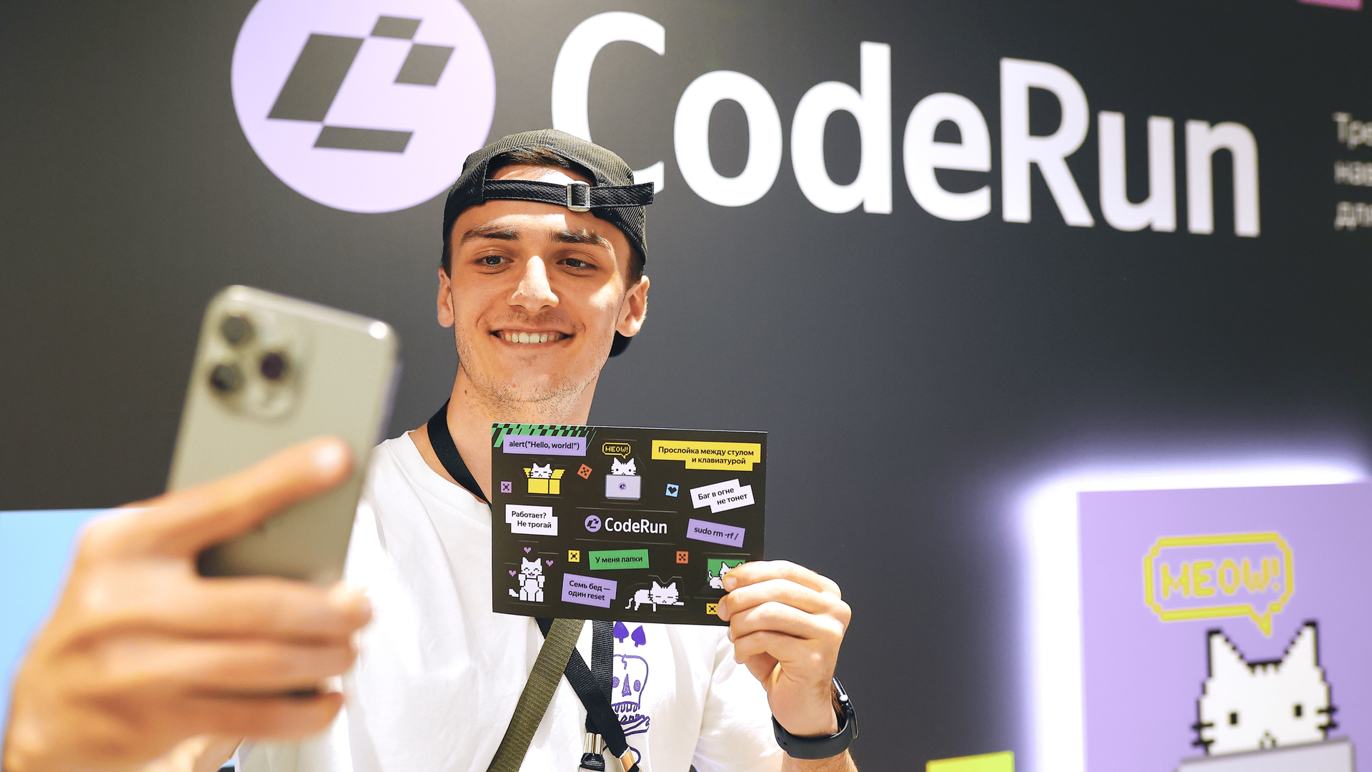
The illustrations are a lively mix of styles — just like a real team, where each person brings something unique. We swapped out tired tech clichés like brackets and slashes for fun nods to memes, retro-tech aesthetics, and 8-bit games.
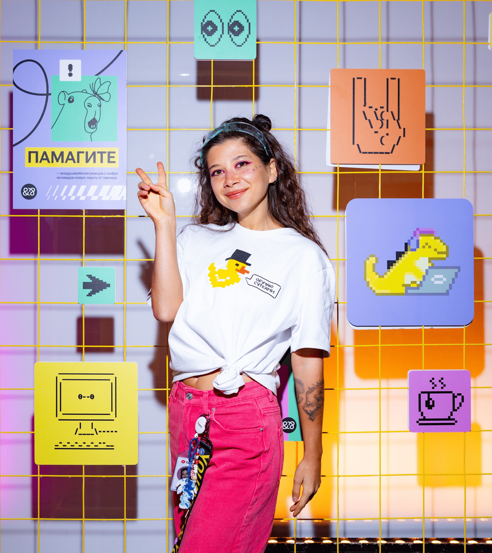

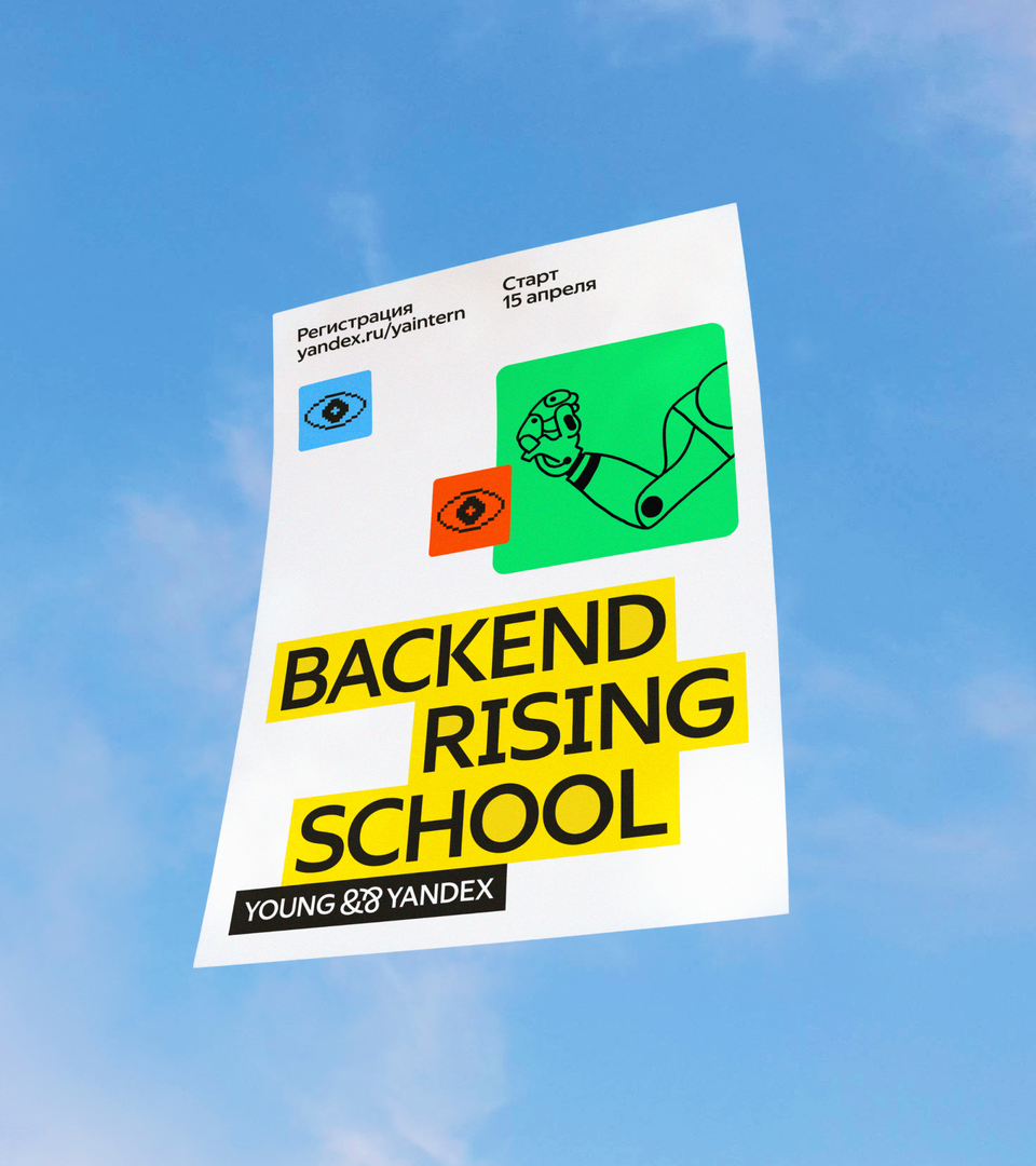
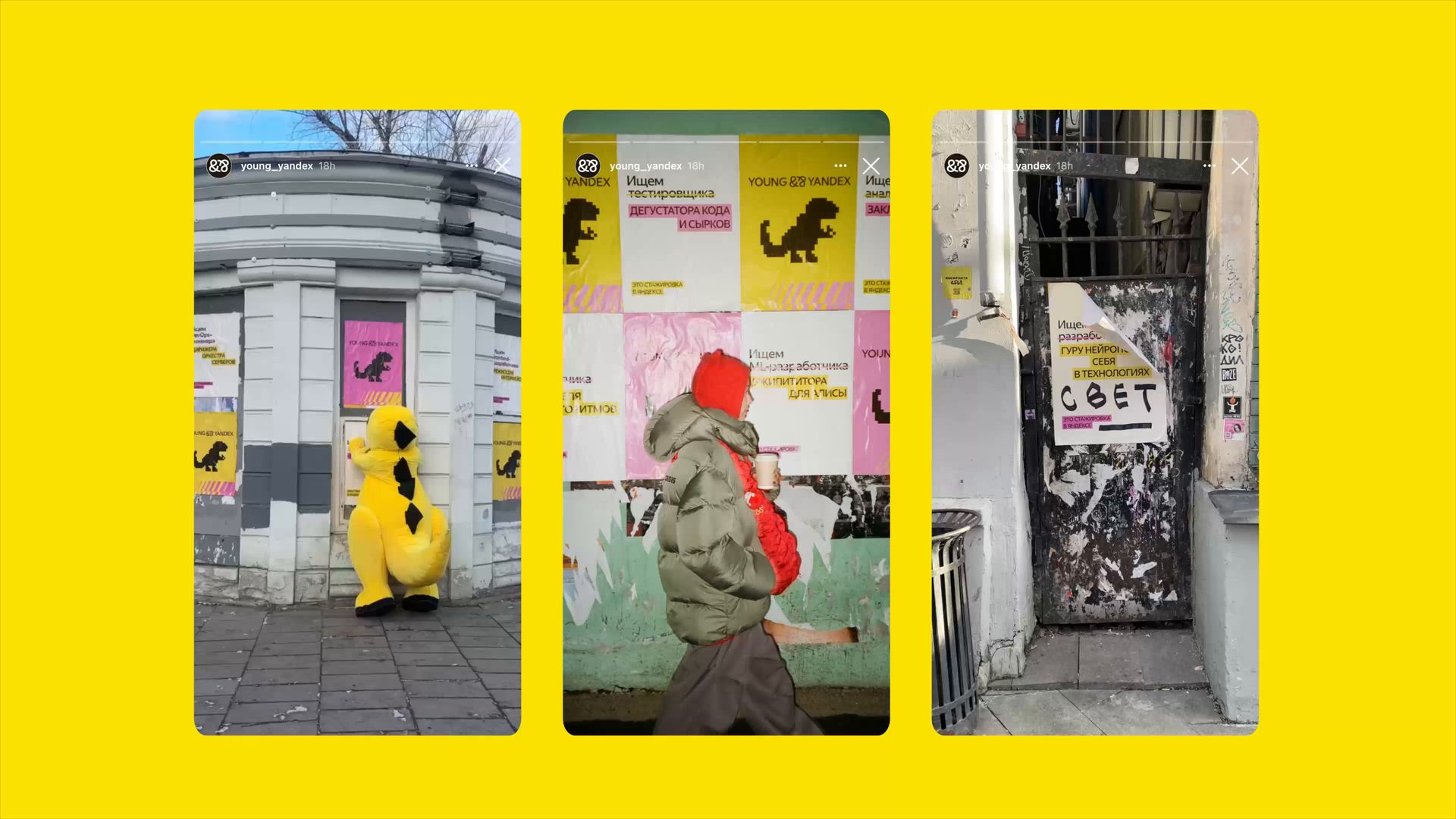
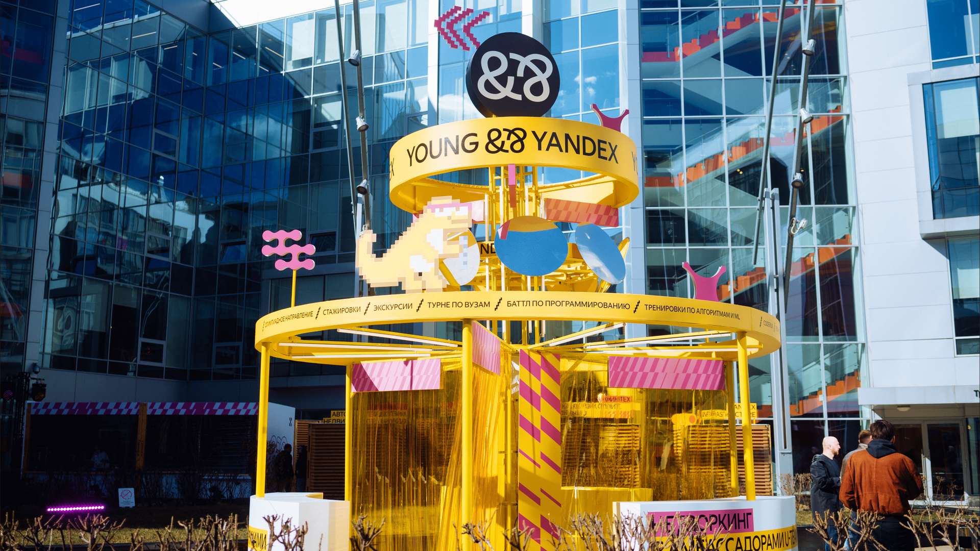
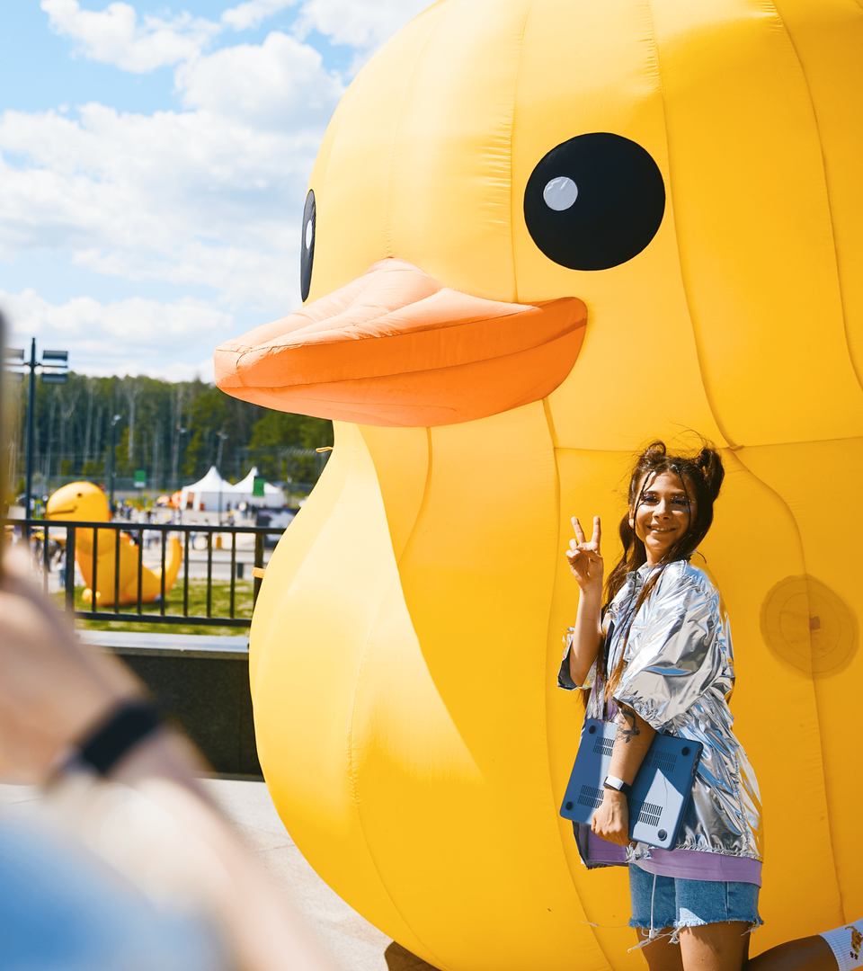
From socials and merch to videos and outdoor campaigns, the new brand identity just works. It’s bold and colorful, yet unmistakably Yandex. It sends a clear message to young IT pros: this is a place where you are free to try, make mistakes, and grow — with support from day one.
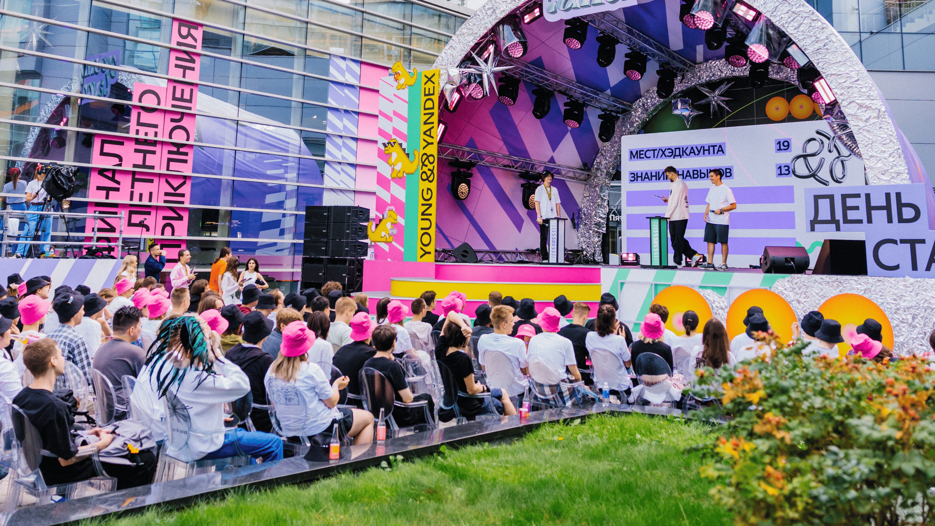

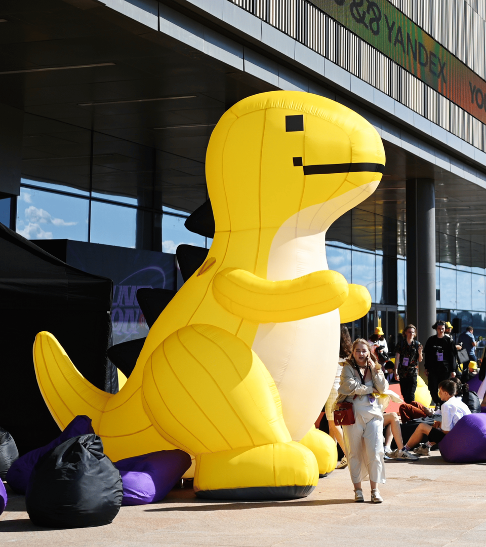
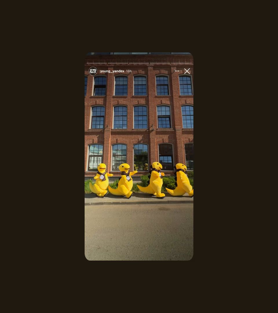
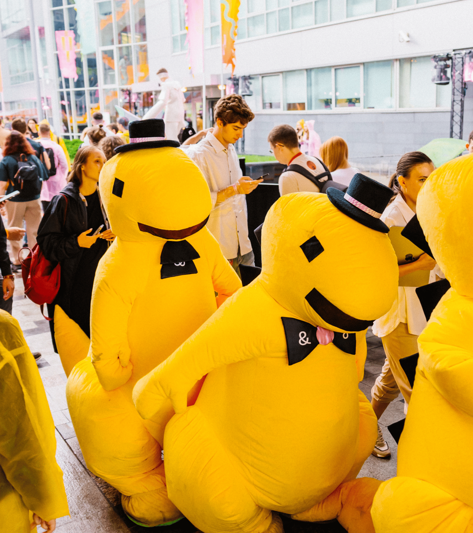
We created a detailed guidebook and trained the Y&&Y team to use it. Now, they’re equipped to bring the brand to life on campus, at career events, and in public spaces. The identity is already evolving, attracting fresh talent into the Yandex ecosystem. Which to us means that we got it right.







Art Direction
Agency Partner
Web Design
Animation
3D Character Design
Illustrations
Project-manager
Case Study Art Direction
Case Study Design
Case Study Motion Design
Case Study 3D Art
Case text
Head of Youth Affairs (Y&&Y)
Marina Maksimova
Art Director (Y&&Y)
Masha Larionova
Marketing Manager (Y&&Y)
Katya Ivanova
Product Marketer (Y&&Y)
Ksenia Sukhotina
Illustrations (Y&&Y)
Karina Dehtyar, Irina Kravtsova
Senior Producer (Studio 7.47)
Inna Omelchenko
Creative Director (Studio 7.47)
Alexandra Novokhatskaya
Producer (Studio 7.47)
Andranik Saaryan
Purchasing Manager (Studio 7.47)
Ksenia Kovalchuk
Photo
Client
Year
2024–2025